Exploring Canvas Widget in Instant JChem
This documentation outlines practical applications of Canvas Widget, demonstrating its ability to enrich both form views and grid views for external graphical designs.
Introduction
The Canvas Widget is a powerful tool for dynamic data visualization, turning numbers and texts into interactive graphs, diagrams, and other easy-to-read graphics. It's a great helper in instrumental analysis, allowing you to individually pick, parameter-select (e.g. selecting the top 5 peaks), zoom, modify or compare data points and much more. Accessible in both grid and form views, the Canvas Widget provides the convenience of analyzing all your data on a single screen.
Examples of Usage
The following examples offer a brief glimpse into what the Canvas Widget can do and how it works. If you're looking for more details, check out the additional links provided at the end of this document.
Example 1: Pie chart
Incorporating pie charts into sample analysis offers a different perspective on relations and distributions across the data set. Pie charts are great tool for:
- Simplification: Pie charts transform complex chemical data into understandable segments, illustrating parts of a whole for clearer insights.
- Immediate Understanding: They provide an instant visual representation of specific characteristic' distribution, making it easier to grasp the data's essence.
- Comparative Analysis: By displaying component proportions, pie charts facilitate the comparison between similar samples, highlighting differences effectively.
Here are the steps to follow to display data as Pie chart in a Form View:
-
Open Form editor in Design mode and add Canvas Widget.
-
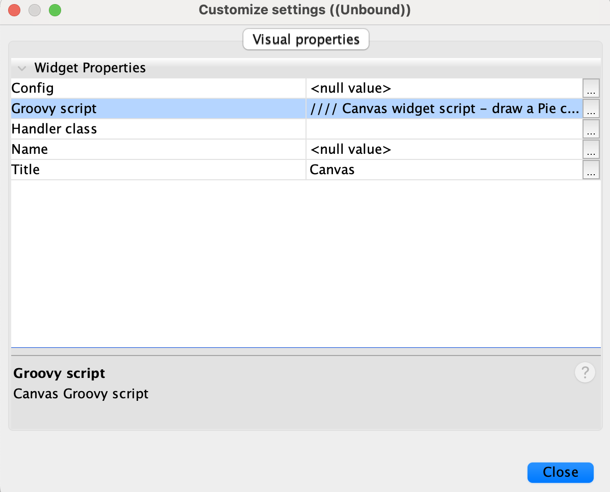
Right click on the Canvas widget and select Customize widget settings.
-
Copy the script below to
Groovy Scriptwidget property and replacein the fieldName = "<field_name>"part of the script with your field of interest. Close Customize settings window.
//
// Canvas widget script - draw a Pie chart from values of one field.
//
// Common parameters:
//   widget is IJCWidget instance
//   canvas is JPanel instance

// IJC imports
import com.im.df.api.ddl.*
import com.im.df.api.dml.*

// Java imports for drawing
import java.awt.BasicStroke;
import java.awt.Color
import java.awt.Graphics2D
import java.awt.RenderingHints
import java.awt.event.MouseEvent

// Chart imports
import java.text.DecimalFormat;
import org.jfree.chart.ChartFactory;
import org.jfree.chart.ChartPanel;
import org.jfree.chart.JFreeChart;
import org.jfree.chart.labels.PieSectionLabelGenerator;
import org.jfree.chart.labels.StandardPieSectionLabelGenerator;
import org.jfree.chart.plot.PiePlot;
import org.jfree.data.general.DefaultPieDataset;
import org.jfree.data.general.PieDataset;

// global variables
chartIds = null
fieldName = null

// onInit is called when the canvas is initialized
//
onInit = { widget, canvas, config ->
    println "onInit"

    fieldName = config["fieldName"]
    if (fieldName == null) {
        fieldName = "<field_name>"
    }

    def rs = widget.form.resultSet
    def rootEntity = rs.dataTree.rootVertex.entity
    def fields = rootEntity.fields.items
    def dataField = fields.find { it.name == fieldName }

    def rootVS = rs.rootVertexState
    //def ids = rootVS.selectedRowsIds
    def ids = rootVS.ids
    chartIds = ids.toSet()

    def dataset = createDataset(rootVS, ids, dataField)
    createAndDisplayChart(canvas, fieldName, dataset)
}

// onVSChange is called when some vertex state is changed - e.g. change in selection
//
onVSChange = { widget, canvas ->
    def rs = widget.form.resultSet
    def rootEntity = rs.dataTree.rootVertex.entity
    def fields = rootEntity.fields.items
    def dataField = fields.find { it.name == fieldName }

    def rootVS = rs.rootVertexState
    //def ids = rootVS.selectedRowsIds
    def ids = rootVS.ids
    println ids

    if (ids.isEmpty() || ids.toSet().equals(chartIds)) {
        println "onVSChange - NOT painting"
        return
    }

    println "onVSChange - painting"
    chartIds = ids.toSet()

    def dataset = createDataset(rootVS, ids, dataField)
    createAndDisplayChart(canvas, fieldName, dataset)
}

// onDestroy is called when the canvas is disposed to do clean-up if necessary
//
onDestroy = { widget, canvas, release ->
    println "onDestroy"
    canvas.removeAll()
    chartIds = null
}

/////////////////// Chart functionality ///////////////////

def createDataset(rootVS, ids, dataField) {
    def valueCount = [:]
    def data = rootVS.getData(ids, [dataField].toSet(), DFEnvironmentRO.DEV_NULL)
    data.each { rowId, values ->
        def value = values.get(dataField.id)
        def count = valueCount[value]
        if (count == null) {
            count = 1
        } else {
            count++
        }
        valueCount[value] = count
    }

    def dataset = new DefaultPieDataset()
    valueCount = valueCount.sort()
    valueCount.each { value, count ->
        dataset.setValue(value, count)
    }
    return dataset
}

def createAndDisplayChart(canvas, fieldName, dataset) {
    JFreeChart chart = ChartFactory.createPieChart("Pie Chart of " + fieldName,
            dataset, true, true, false);
    //JFreeChart chart = ChartFactory.createPieChart3D("Pie Chart of " + fieldName,
    //        dataset, true, true, false);

    PieSectionLabelGenerator labelGenerator = new StandardPieSectionLabelGenerator(
        fieldName + " {0} : ({2})", new DecimalFormat("0"), new DecimalFormat("0%"));
    ((PiePlot) chart.getPlot()).setLabelGenerator(labelGenerator);

    ChartPanel panel = new ChartPanel(chart)
    canvas.removeAll()
    canvas.add(panel)
    canvas.validate()
    canvas.repaint()
}
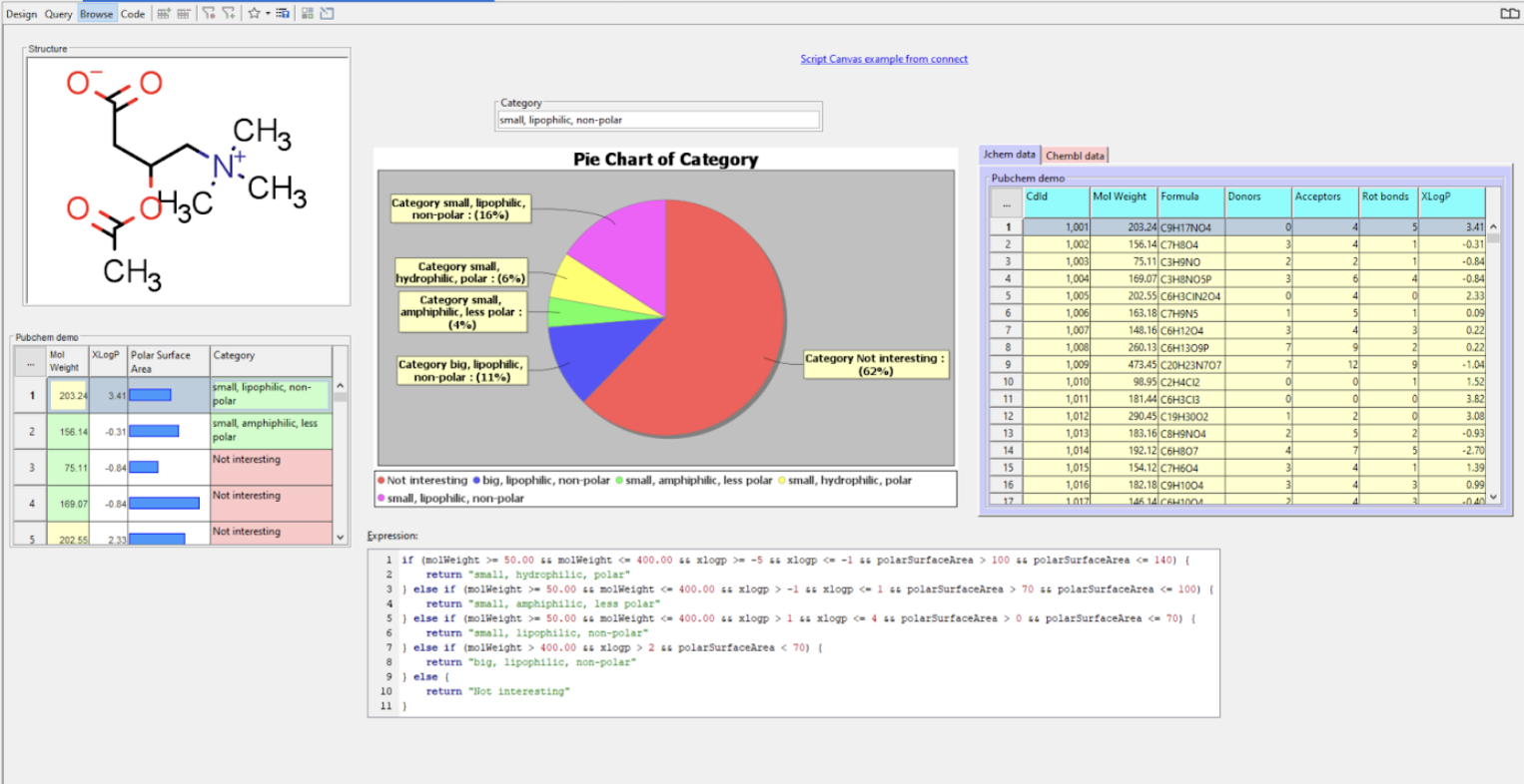
In this example, pie chart was created from a calculated field called Category, which distributes molecules in data set according to their on hydrophobicity, molar weight and polarity.
Example 2: Mass Spec Graphs
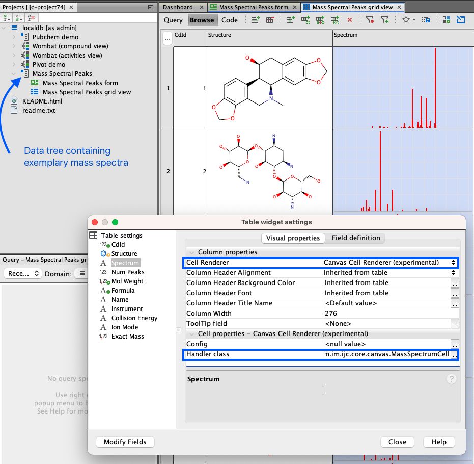
The Canvas Widget offers the capability to visualize measurement readings, allowing them to be displayed alongside other pertinent data in both grid and form views. To demonstrate this functionality, there is a data tree called Mass Spectral Peaks in IJC's demo-project.
-
Crate new IJC project with local database and demo data.
-
Go to
Mass Spectral Peaksdata tree and open grid view (blue icon). -
Right click on
Spectrumfield and select Customize Widget Settings. -
In the screenshot provided below, two distinct rows are highlighted with blue rectangles.
Cell Rendererdetermines the display format for the data within the specified field. The default setting isCanvas cell renderer, explaining why the data appears as an image.
-
Change the
Cell RenderertoMulti line text rendererand close the Customize Widget Settings window. Spectrum field is now displayed as array of numbers - [x,y] coordinates of the top of each peak. -
Switch the
Cell Rendererback to the defaultCanvas cell renderer. Note, that the spectra are not rendered. Why? -
For the
Canvas cell rendererto work correctly, it requires specific instructions on data handling. This role is filled by theHandler Class. Refer to the previously mentioned image where a distinct blue rectangle is highlighted. In simpler terms, theHandler Classoffers guidance on data processing. To configure this, select the three dots button adjacent toHandler Class, which will bring up the edit window. There, enter:com.im.ijc.core.canvas.MassSpectrumCell. -
Close Customize Widget Settings window. Mass spectrum is now visible again.
-
Open
Mass Spectral Peaksform view. Note, that the Canvas Widget within this view is interactive. As previously stated, it offers a broad range of functions which can be customized as necessary.
Links to Related Documentation
- For a brief overview of Canvas widget in Instant JChem click here.
- For additional Canvas widget examples and instructions on how to install IJC plugins, click here.
- Interested in building your own plugins? Click here.
Should you require a solution precisely tailored to your specific needs, the Instant JChem support team is ready to assist. Contact us via Chemaxon Freshdesk for custom-designed plugins.